September, 21st 2020
Managing Line-breaks in Web Typography
The Problem
Good typography and copy requires a line-break management. Especially when the project you're working on is a multilingual website of 11 languages. But even in the world of different viewport sizes, fonts and languages, it's possible to take control over it. That's where good old HTML comes to help.

Sometimes it's a long word that creates unnecessary whitespace. German is known for having one of the longest words and making designers upset all the time.
Many forget that all this can be solved by HTML. Each case requires a different fix: usage of <br>, <wbr> or ­
Disclaimer
Putting <br> and other html tags in the text, means you should use .innerHtml method when rendering the texts with Javascript.
This is generally not safe and requires additional precautions to be made. Among other things, you should absolutely make sure you sanitise the text before inserting it into the DOM allowing only a few tags to be present.
<BR> and <WBR>
By itself <br> tag is self-explanatory: it's a "break" in a line of text. At Boldking we use it most of all, together with some simple additions.
<wbr>'s (word-break) behaviour is similar, but it breaks the word only if that is actually needed. The rest of the things applies to <wbr> exactly same way as to <br>.
We optimise line-breaks separately for our two main breakpoints — mobile and desktop — so we additionally use custom attributes like <br data-m> and <br data-d>.
Attribute names here don't matter: you can use classes the same way. For us it was important to keep raw texts readable and use as less symbols as possible. Using just d and m (without data) as attributes names is practically fine, but is not valid from HTML5 point of view; according to the standard all custom attributes should be prefixed with data. However many websites just ignore that.
CSS declaration for that looks like this:
/* css */
br[data-d],
wbr[data-d] {
  display: none;
}

br[data-m],
wbr[data-m] {
  display: inline;
}

/*
  We use CSS custom media queries,
  --md is the same as (min-width: 768px)
*/

@media (--md) {
  br[data-m],
  wbr[data-m] {
    display: none;
  }

  br[data-d],
    wbr[data-d] {
    display: inline;
  }
}
Here, we disable all <br> elements generally, then enabling it depending on the media query and data-attribute.
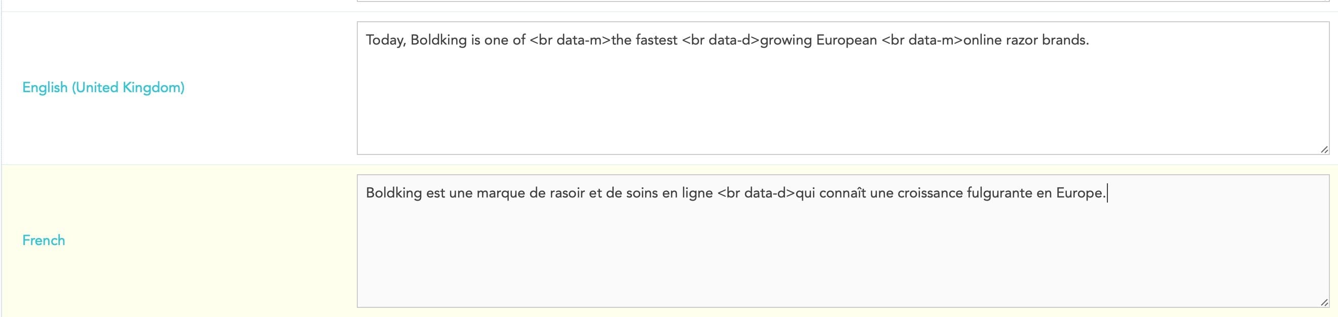
From the admin point of view it looks like this. Notice that line-breaks for mobile and desktop are set in different places and don't match. The same applies to different languages (see French text on the image).
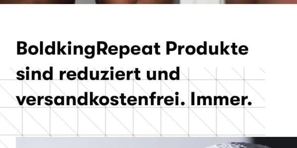
Soft Hyphen Character (­)
It's a entity that works similar to <wbr> but adds a hyphen at the end of the line-break. It's magic: once the line-break is gone, the hyphen disappears. See yourself:


Contenteditable
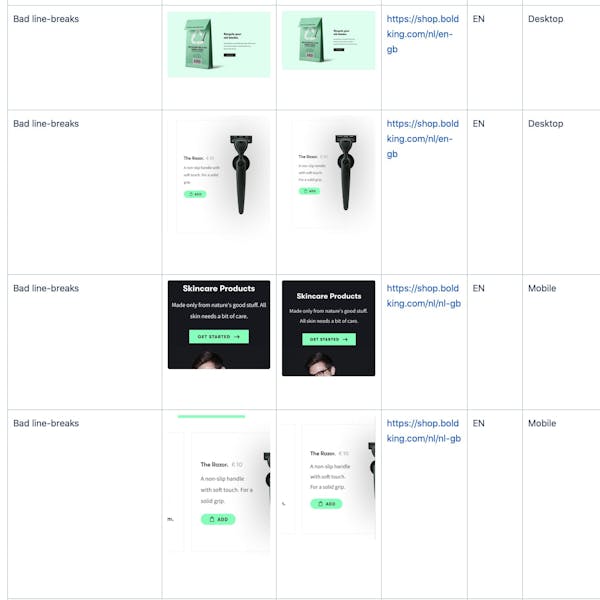
This is not directly related to line-breaks but I found it really handy. Basically contenteditable attribute on any element makes it a simple WYSIWYG editor. You can select and edit text right-away in the browser, and adding <br> using Shift+Enter.
I use that technique a lot when reviewing copy changes on our staging environment. This way in case of typography issues I can first check what would be the best fix, so then copy-team could do the needed changes. Check one the reports on the image below.